> This is part 1 of 3 of the full documentation (pages 1–100 of 243).
> The content is paginated: fetch every part to see all of it.
> Next part: https://docs.quantumbyte.ai/llms-full.txt/1
> Page index: https://docs.quantumbyte.ai/llms.txt
# Fundamentals
Whether you’re just starting with prototypes or scaling to enterprise-level apps, QuantumByte helps you solve real world problems through creating apps with simple prompts and guided tools.
## Our Solutions
In QuantumByte we believe that building an app should be inclusive to everyone. QuantumByte marries AI-driven generation with no-code customization, so the platform allows you to get a fully functional, business-ready app in hours, tailored to your domain expertise and goals.
Before we dive in, it is important to understand the **basic concept of QuantumByte** so that you can leverage the benefit of using our platform.
1. **Write a structured prompt in natural language**. Creating an app has never been easier, simply describe your idea, who it’s for, and what problem it solves.
2. **Our platform generates the foundation of your app**, including the frontend, backend, roadmap, data schema, CMS, and dashboard.
3. **Refine your app through guided tools with natural language editing.** Customization only requires you to describe how you want your app to look and function and QuantumByte will translate it into a full functioning app with its structure, design, and logic.
4. **Brainstorm business concepts and strategies** with features like Impact and Goals in QuantumByte. In our platform, you don’t only build an app, you will also explore how your app will work, who it will serve, and how it can grow sustainably.
At its core, QuantumByte is an AI-powered no-code app builder. This means you can build complete applications without writing traditional code. Instead, you guide the system with prompts.
Prompting in natural language is not only for the initial app creation, it also applies to generating new features and designing the user interface (UI) in **Project**. Prompts serve as the highest level of customization, allowing you to shape your app intuitively.
For users who want more control, QuantumByte also supports further customization across different layers. You can move from high-level prompting, down to editing features and data models, and finally to the **Code Editor** for precise, low-level changes when needed. This layered approach gives flexibility: start simple with prompts, and go deeper only when necessary.
# Get Started
Start building your app with natural-language Prompt
## Prompt
You can start building your app by entering a prompt in either of the following ways:
* **From the Landing Page:** Enter your app idea in the prompt field and click "Build my AI — free". If you need inspiration, browse the **Some Inspirations** section and select an example prompt to populate the input field

* **From the Dashboard:** After signing in, user redirected section on the Dashboard and enter your prompt. You can also click **Random Ideas** to generate a sample prompt and use it as a starting point.

Both entry points use the same app generation workflow. After you enter a natural-language prompt and submit it, the system will direct user to chat with QuantumByte **AI Agent**.
## Deep Dive into Your Idea
{% hint style="success" %}
Available in v3.1.1
{% endhint %}
The Agent guides you during the initial setup to ensure your application is built to your exact needs. It can be accessed through either a **speaking** or **chatting** interface. Its primary role is to engage in a conversational interview, collecting detailed information and clarifying your requirements to create a highly accurate and comprehensive specification. Once this interactive process is complete, the Deepdive Agent seamlessly sends the finalized specification to the platform to begin the app generation process.
Once the app generated, you will begin your app editing on **Canvas**, a visual framework that captures the essence of the product concept.
# Canvas
Once your submit your prompt, the system will directs you to Canvas where you can see the high-level concept of your app.
{% hint style="success" %}
Updated in v3.2.0
{% endhint %}
## Concept
Canvas is the structured blueprint that QuantumByte generates from the user’s idea. It captures the core of the product concept. Unlike a blank document or slide deck, the Canvas is auto-generated and organizes the user’s thoughts into sections.
The key sections in Canvas act as a guided tools. It sections designed to help you brainstorm about your product, from concept to impact.
| Sections | Description |
| ----------------------- | -------------------------------------------------------------------------------------------------------------------------------------------------------------------------------------------------------------------------------------------------------------------------------------------------------------------------------------------------------------------------------------------------------------------------------------------------------------------------------------------------------------------------------------------------------------------------------------------------------------------------------------------------------------------------------------------------------------------------------------------------------------------------------------------------------------------------------------------------------------------- |
| **Cover** | Cover displays the title, tagline, and app preview of the app created from prompt. The title and tagline in the cover is customizable. |
| **Foundation** |
This section highlights three points: Problem Statement, Strategic Direction, and Core Value Proposition.
Problem Statement states why the product needs to exist and which specific issues or inefficiencies it addresses. Identifying these early gives the rest of the Canvas a clear purpose and direction.
Strategic Direction is the foundational plan that defines what a product aims to achieve in the long term and why it matters. This direction acts as a guiding framework, ensuring that every decision coherently contributes to the overarching business goals.
Core Value Proposition is statement that explains the fundamental benefit your product provides to a specific user.
|
| **Impact** | **Impact** page includes all personas aimed by the products and how the product will be used by the personas. |
| **Product** **Roadmap** | The **Product Roadmap** is the central hub where your application's development plan is generated and managed. It breaks down the build process into specific tasks, which are categorized as either **AI Task** (handled automatically by the platform) or **User Task** (requiring action from human developers). You can prioritize the order of these tasks, track the overall progress of your app, and from this page, access advanced tools like Pro Build, the Advanced Editor, or the Code Editor to move forward. |
| **Chat Agent** | The Chat Agent allows you to modify your application using natural language, simply by typing instructions to an AI Developer. You can specify which part of the app you want to change, ensuring targeted updates. For specialized guidance, you can interact with one of four distinct AI personas: the **Visionary**, the **Designer**, the **Consultant**, or the **Engineer**. For a detailed guide on using this feature, please refer to the full **Chat Agent** documentation. |
## Editing and Ripple Effect
Canvas allows users to **modify any component of their generated concepts**, from any concept starting with **Cover**, **Foundation**, **Impact**, and **Product Roadmap**. Each edit is not only a change in description but also a functional update that affects how the application behaves.
Because Canvas's **Concept** serves as the conceptual foundation of the app, every edit directly influences its logic, structure, and interactions. For instance, if a user changes a goal or adds a new process in the Canvas, the system will adapt the app’s corresponding modules, pages, or services to match that intent. This makes the Canvas a true source of control, where conceptual updates translate into operational outcomes.
# Editing, Ripple Effect, and Planner
{% hint style="success" %}
Available in v3.1.1
{% endhint %}
### Canvas Edit
Canvas Edit allows users to **modify any component of their generated Canvas**, such as challenges, goals, features, and product overview. Each edit is not only a change in description but also a functional update that affects how the application behaves.
Because the Canvas serves as the conceptual foundation of the app, every edit directly influences its logic, structure, and interactions. For instance, if a user changes a goal or adds a new process in the Canvas, the system will adapt the app’s corresponding modules, pages, or services to match that intent. This makes the Canvas a true source of control, where conceptual updates translate into operational outcomes.
### Ripple Effect
The **Ripple Effect** is the **automated process that evaluates the impact of each edit** across the entire project. When a user modifies something on the **Canvas**, the system analyzes how that change affects interconnected components such as the Roadmap, pages, data models, and service APIs.
This analysis ensures that all parts of the project stay in sync. For example, adjusting a data-related element on the Canvas could prompt the system to revise the Data Editor schema or update dependencies in the backend service. By managing these relationships automatically, the **Ripple Effect prevents inconsistencies** and ensures the app continues to function in alignment with the updated concept.
### Planner
The Planner acts as the **coordination and approval layer after the system** performs the ripple analysis. It compiles a summary of all detected changes, showing how updates to the Canvas will affect other parts of the app. Users can then review and approve the suggested modifications before they are applied.
Once approved, the Planner executes the necessary updates across the system, refreshing the Roadmap, regenerating relevant app modules, and ensuring that the live app remains coherent with the latest version of the Canvas. This process ensures that both the conceptual and operational layers of the product evolve together, allowing users to manage complex projects without breaking functionality or alignment.
# Roadmap
{% hint style="success" %}
Available in v3.1.0
{% endhint %}
The Roadmap provides a **visual timeline** of the steps needed to transform an idea into a working product. Once the Canvas is generated, the Roadmap automatically organizes actions in stages, allowing users to see how each task connects to broader objectives. Each milestone represents a meaningful phase of development, such as core platform setup, system integration, and contains a series of tasks labeled either as **AI Tasks** (handled automatically by the system) or **User Tasks** (requiring user input or **Human Developer**).
Every task requires an explicit action to move forward. For **AI Tasks**, users can initiate generation from the Roadmap; the system then executes the step and returns the result. For **User Tasks**, users can provide the required input or hand the item to a **Human Developer** when specialist work is needed. This keeps ownership clear and ensures that progress reflects deliberate decisions.
The Roadmap provides clear visibility into project status by displaying progress bars, completion percentages, and real-time indicators such as **In Progress**, **Blocked**, or **Backlog**. This allows users to track advancement at both the milestone and task level. Dependencies and exit criteria are clearly defined, helping users understand what must be completed before moving to the next phase. The Roadmap helps users maintain focus and accountability.
# Studio
The Studio is the main workspace where users shape, refine, conceptualize, and visualize their products.
After the platform generate your prompt into Apps, you will get directed to the Studio where you can describe what you want to build in natural language, and the system interprets these descriptions to generate an interactive Canvas that outlines the product’s logic, structure, and direction.
Within the Studio, users can describe what they want to build in natural language, and the system interprets these descriptions to generate an interactive canvas that outlines the product’s logic, structure, and direction. Users who may not have a background in programming or system design can still articulate their goals and see them transformed into functional prototypes. It supports an iterative process where every adjustment, whether in text, structure, or design, is reflected across the entire system to maintain coherence.
# App Preview
The App Preview provides a live simulation of the generated application within a mobile-like environment. It allows users to see how their web app appears and behaves on a device, interact with screens and navigation flows, and observe how each component connects as the concept evolves.
As the Canvas is refined and work progresses in the Roadmap, users can regenerate the preview to reflect the most recent state of the product. This feature helps validate design choices, confirm expected functionality, and identify adjustments needed before moving toward production.
# Page Editor
{% hint style="info" %}
Coming soon in v3.1.1
{% endhint %}
The Page Editor gives users **hands-on control** over how their application looks and behaves. It provides a clear, editable view of each page’s layout, structure, and interface elements, allowing users to make precise adjustments by description, without directly writing code. Changes such as rearranging sections, modifying text, or updating button actions can all be performed using plain, natural language commands.
Every edit made through the Page Editor is automatically translated into real code behind the scenes. The system maintains a one-to-one synchronization between what users describe and the underlying source code that defines the page. This ensures that the design layer and the technical layer are always aligned, reducing the risk of visual or functional inconsistencies.
The Page Editor is especially valuable for refining the user experience after the initial generation. For example, users can adjust layout spacing, rename labels, or update user interactions by simply describing, and the platform will instantly regenerate the corresponding code. By maintaining this direct connection between intent and implementation, the Page Editor enables rapid iteration, accurate previews, and reliable updates, all without requiring manual coding effort.
# Data Editor
{% hint style="success" %}
Available in v3.1.1
{% endhint %}
The **Data Editor** enables users to design, view, and modify the data structure of their application in a simple, intuitive way. Instead of working directly with database schemas, users can describe their desired data model using natural language. The system interprets these descriptions to create or update entities, fields, relationships, and tables that define how information is stored and connected within the app.
Every change made in the Data Editor is reflected immediately in the underlying code, maintaining **one-to-one synchronization** between human-readable descriptions and the actual data definitions used by the system. This synchronization ensures that data models remain accurate, consistent, and aligned with the overall logic of the application.
For example, users can easily create a new entity such as “Customer,” specify its attributes (name, email, purchase history), and define relationships to other entities like “Orders” or “Products.” The system then generates the appropriate backend structures automatically.
By combining clarity and automation, the Data Editor gives both technical and non-technical users a complete understanding of how their app’s data operates, while removing the complexity of manual database management or code editing.
# Service (API) Editor
{% hint style="info" %}
Coming soon in v3.1.1
{% endhint %}
The **Service (API) Editor** allows users to create and manage the backend services that power their applications. Through natural language, users can describe or modify how data should be processed, retrieved, or connected between different parts of the app. The system interprets these inputs and automatically generates the corresponding service code.
Every description and code snippet remain synchronized, ensuring that what users define conceptually always matches the actual backend implementation. This feature helps maintain clarity and consistency across the system, making it easier to update logic, link data models, or adjust workflows as the application evolves. It bridges the gap between idea and execution, allowing users to design functional APIs without needing to write code manually.
# Projects Page
All of your prompted app projects are displayed here
Projects Page is a page containing all the projects you are working on, making it easy to view and access them at any time.
QuantumByte Project Dashboard
#### Create App from Dashboard
If you want to create another project after creating the first one, simply **go to the Projects Page**, then at the right corner, click the “**Build Your App**” button, and you’ll be directed to the prompt-based app builder to get started.
#### Dashboard Feature
Beyond just listing projects, the Dashboard giving you a unified environment to manage applications, collaborators, and configurations.
Feature
Descriptions
App Starters
Quickly launch new applications from a structured prompt.
Application List
Host and manage multiple apps, each with its own frontend and backend.
Collaborators and Roles
Invite team members and assign roles (Admin, Builder, Operator, Viewer) to set responsibilities and access level
Environments
Work across two environments, Preview (for fast testing) and Deployed (for stable releases).
Domains
Use a default QB subdomain or connect your own custom domain with SSL.
Project Settings
Manage shared assets, integrations, and environment variables across all apps in the Workspace.
# Development Service
The Development Service provides the execution layer that turns the Roadmap from the Studio into a working product. It combines automated AI-driven development with the option to engage professional human teams when deeper customization or precision is required. Together, these services ensure that every idea generated in the Studio can progress from concept to deployment efficiently and reliably.
# AI Dev Agent
{% hint style="success" %}
Available in v3.1.0
{% endhint %}
The AI Dev Agent is an automated development assistant that executes the steps defined in the Roadmap. It can generate, edit, and deploy code based on the planned milestones created in the Roadmap. By interpreting the structure and logic of the Canvas, the AI Dev Agent ensures that each technical implementation aligns with the user’s goals and business logic.
This agent operates continuously in the background, managing dependencies, validating outputs, and ensuring that the system remains coherent as updates occur. Users can monitor progress or make adjustments directly within the platform without having to handle code manually. The AI Dev Agent significantly reduces development time and allows users to iterate faster from concept to functional product.
# Human Developer Service
{% hint style="info" %}
Coming soon in v3.1.1
{% endhint %}
The **Human Developer Service** provides an option for users who require expert intervention for complex or high-precision projects. Through this service, **QuantumByte** connects users with professional developers, designers, and product managers who can help refine, enhance, or scale their applications.
Before work begins, the platform estimates the scope of effort in **Story Points (SP)**, giving users a clear understanding of cost and delivery expectations. The assigned team then implements tailored solutions that align closely with the user’s Roadmap and existing Canvas.
This service complements the AI Dev Agent by handling intricate customizations, integrations, or creative design tasks that require human expertise. It ensures that even advanced technical requirements can be addressed within the same unified ecosystem, bridging the gap between automated generation and production-ready development.
# Usage and Cost Orchestrator
{% hint style="success" %}
Available in v3.1.0
{% endhint %}
The Usage and Cost Orchestrator gives users clear oversight of resource consumption and spending. It covers real-time usage visibility, predictable credit deductions, convenient top-ups, and internal cost controls that keep pricing stable over time.
# Usage Tracker
The **Usage Tracker** records all resource consumption within the platform. It includes AI token usage, server workload, network requests, and storage utilization. Users can review granular summaries to see where credits are being spent and identify opportunities to optimize. Reporting focuses on clarity, so teams can track trends, spot unusual spikes, and adjust behavior before costs increase.
# Auto-Credit Deduction and Usage Limiter
The Auto-Credit Deduction feature applies charges automatically whenever an action consumes credits. The Usage Limiter enforces balance-aware limits to prevent accidental overuse. Together, they keep spending predictable by aligning consumption with available credits and by stopping executions once limits are reached. Users retain control through clear notices and up-to-date balances.
# Credit Top-Up and Billing System
The **Billing System** enables fast, reliable credit top-ups using supported payment methods such as e-wallets, cards, bank transfers, and QRIS. A wallet view shows current balance, recent transactions, and detailed charge records. This makes it straightforward to reconcile spending, plan future usage, and keep projects running without interruption.
# System Source of Truth
The System Source of Truth serves as the unified repository that holds all essential elements of each user’s application, including source code, domain data, and digital assets. It ensures that every change is stored, versioned, and traceable.
# Code Storage
{% hint style="success" %}
Available in v3.1.0
{% endhint %}
The Code Storage feature securely stores all generated source code within a centralized environment. Each update is automatically versioned, enabling users to access historical revisions or restore previous states when necessary. This system preserves development history and ensures that the application’s codebase remains both secure and auditable throughout its lifecycle.
# Code Editing (Repository Viewer)
{% hint style="info" %}
Coming soon in v3.1.1
{% endhint %}
The **Code Editing (Repository Viewer)** introduces a built-in interface for viewing and modifying stored code directly inside the platform. Users can browse, review, and make minor adjustments to files without needing external development tools. This allows quick edits, code inspection, and version comparison, making it easier to maintain consistency between AI-generated content and manual refinements.
# Domain Data Storage
{% hint style="info" %}
Coming soon in v3.1.1
{% endhint %}
The **Domain Data Storage** manages the structured data elements that define how an application operates. It stores entities, attributes, and relationships that form the logical foundation of the system. By keeping all data definitions synchronized with the active version of the application, this feature ensures that the backend logic remains aligned with what users see and configure in the Canvas and Data Editor.
# Domain Data Editing (Repository Viewer)
{% hint style="info" %}
Coming soon in v3.1.1
{% endhint %}
The **Domain Data Editing (Repository Viewer)** provides a visual interface for modifying stored domain data. Users can view relationships between entities, adjust attributes, and edit constraints without writing database commands. Every change is synchronized in real time with the backend, allowing smooth coordination between conceptual models and actual data implementation.
# Asset Storage
The **Asset Storage** acts as a centralized library for all visual and brand-related materials, such as images, icons, logos, and other design assets. It ensures that every component is properly cataloged and linked to the correct version of the application. Centralization prevents duplication and simplifies the process of managing brand consistency across different parts of the product.
# Asset Editing (Repository Viewer)
The **Asset Editing (Repository Viewer)** allows users to access, preview, and update stored assets directly within the system. Users can replace images, upload new versions, or reorganize visual elements without disrupting the live application. Each change remains synchronized with the deployed version, ensuring that updates to branding or interface visuals are accurately reflected across the platform.
# Delivery and Runtime
The **Delivery and Runtime** layer provides the environment where applications are built, tested, and executed. It connects outputs from the Studio, Editors, and Development Services into a continuous workflow from concept to running software. The goal is to remove local setup friction, keep execution predictable, and provide fast feedback during iteration.
# Development Environment
{% hint style="success" %}
Available in v3.1.0
{% endhint %}
The **Development Environment** is a fully managed, cloud-based space for running and previewing applications. Users do not need to install SDKs, package managers, or build tools locally. The platform compiles and executes generated code automatically, then serves a live preview for quick validation.
# Module & Template Registry
The **Module & Template Registry** acts as the centralized directory for all reusable components that can be instantiated within a generated product. It ensures consistency, version control, and interoperability across products. Through this registry, all products can reuse core logic, UI patterns, and service integrations without redundancy.
# Service APIs
Service APIs provide access to predefined services that can be called from generated products within QuantumByte. Each API represents a functional service, allowing users to connect their applications with these ready-to-use capabilities. By calling these APIs, users can integrate specific functions or data flows into their products without having to build them manually. The Service APIs are maintained within the QuantumByte ecosystem to ensure consistent behavior, versioning, and compatibility across different generated environments. This approach helps products share the same service logic while remaining flexible in how each service is used or displayed within the app.
# Modules
Modules are the fundamental building blocks of any generated product on QuantumByte. Each module encapsulates a specific functional capability, such as authentication, payment, data management, or AI interaction, that can be plugged into a product during generation. These modules allow the AI to assemble complex applications quickly from pre-tested, interoperable components rather than writing code from scratch.
By maintaining these reusable components in a centralized registry, QuantumByte enables faster iteration, cleaner architecture, and consistent quality across all generated applications. Core examples include the **Authentication Module** for managing user login, registration, and access control; the **Form & Data Module** for handling form creation, submission, and backend storage; the **Payment Module** for processing gateway integrations and transactions; and the **Gated Content Module** for restricting content access according to user roles or subscription tiers.
# Microphone Setup
# Package
Whether you’re just starting with prototypes or scaling to enterprise-level apps, QuantumByte helps you solve real world problems through creating apps with simple prompts and guided tools.
## Prototype
This plan is best for individuals or small teams who want to try things out and quickly test ideas. With this monthly plan, you get the privilege of 1 Project Created, 150 **Credits** to generate your app, and prototyping access for your app.
Prototype plan does not come with the privilege to publish your app, if you wish to see your app live in Website, Android, or iOS, consider scaling up your plan to QuantumByte Pro.
## QuantumByte Pro
This plan is ideal for businesses or developers who are ready to scale. This plan gives you the ability to create how many projects you want to create, choose the storage size you need for your projects, and customize how many **Credits** you want to generate features.
Here you can take your app live and publish it across Website, Android, and iOS. With QuantumByte Pro, you can also unlock more advanced features and greater flexibility to meet your business needs.
## Enterprises
This plan is ideal for large-scale teams and organizations that require advanced capabilities, scalability, and dedicated support. This plan shall be tailored to your organization’s needs, from infrastructure to custom features. You can contact us to discuss a solution that works best for you.
# Getting Started
Our builder empowers you to create web and mobile experiences effortlessly through an intuitive drag-and-drop widget system—no coding required
## Concept
The concept of QuantumByte is a SuperApp, consisting of a **Main App** and multiple **Mini Apps**, developed or integrated using the available features within the QuantumByte Platform.
Each Mini App Developer will receive an account on the QuantumByte Platform, allowing them to either create new services or integrate existing ones into the Main App (Web Portal & Mobile Portal).
The QuantumByte ecosystem enables developers to build services directly within the Main App portal. This approach ensures that only one unified application appears to the public while offering multiple services developed independently by different developers—reducing the need for many separate public apps.
Mobile App Created with QuantumByte
## Main Features
The INA Digital Platform uses our framework and offers several types of development tools that make it easier to integrate new applications or existing ones, as follows:
**Builder (Frontend)**\
This feature is used to create native services within the Mobile App and National Web Portal, as well as dashboard pages for managing services from the back-office side. It uses a drag-and-drop interface with standardized components.
**Package (Frontend)**\
This package/plugin feature is used to build native services within the Mobile App and National Web Portal using code templates. In this method, you create a plugin that will be merged into the Main App’s source code and compiled together.
**Microsite (Frontend)**\
This feature is used to create webview-based services within the Mobile App and National Web Portal using code templates, UI Kit components, and SDK libraries provided as service standards.
**Microservice (Backend)**\
This feature allows you to build backend services using available framework templates. It’s useful for developers who don’t yet have infrastructure or who want to leverage the stability of backend services running on the framework’s server cluster.
**Storage (Backend)**\
This feature is used to store document files within the framework. It can be utilized by those who don’t yet have infrastructure or who want to leverage the stability of the framework’s storage cluster.
**Database (Backend)**\
This feature allows you to create a database on the server for storing data within the framework.
**API Management**\
This feature enables data sharing via APIs through the framework.
***
## Frontend Service
These are recommendations for choosing the appropriate type of frontend, along with their advantages and disadvantages. You may use two different frontend types for the Main App Portal: one for the Mobile version and another for the Web version.
| Frontend Service | Description | Advantages | Disadvantages |
| ---------------- | --------------------------------------------------------------------------- | ----------------------------------------------------------------------------------------------------------------------------------------------------------------------------------------------------------------------------------------------------------------------------------------------------------------------------------------------------- | ------------------------------------------------------------------------------------------------------------------------------------------------------------------------------------------------------------------------------------------ |
| Builder | Suitable for services with simple, form-based UI/UX. |
Good performance (native) except when using webview widgets.
Allows you to quickly build services using drag-and-drop widgets.
Automatically generates both Mobile App and Web App frontends.
No need to update the Main App when changes are made.
|
Limited widget options.
UI/UX customization is restricted and may not fit specific design needs.
Cannot install external dependencies.
Typically used for form-based services.
|
| Package | Suitable for services with complex UI/UX and high performance requirements. |
Services can be developed using fully native code (Base Plugin).
UI/UX can be fully customized to match specific design or functional needs.
Delivers high native performance.
Allows installation of external dependencies.
|
Requires an app update whenever changes are made.
The Mobile App and Web App packages are separate, meaning developers must build each one individually.
|
| Microsite | Suitable for services with complex UI/UX requirements. |
Services can be developed using full web-based code.
No need to update the Main App when changes are made.
UI/UX can be fully customized according to needs.
Automatically generates both Mobile App and Web App frontends.
Supports installation of external dependencies.
|
Lower performance compared to native solutions (runs via WebView).
|
# Builder Guide
# Frontend
# Frontend Services Types
### Builder
The term **“builder”** refers to a service development system that uses a drag-and-drop widget feature. This feature allows users to instantly convert their designs into mobile and web frontends, which can also be directly integrated with existing systems.
One of the most important components within the builder is the **Form Builder**. In simple terms, when you create a form using the Builder, you’re essentially structuring a database — including its fields, data types, validations, and supporting components such as **“Submission”** and **“Payment”** modules — all within a no-code platform.
Every piece of data submitted through a form is automatically stored in a generated database. The data within that database can be accessed via an automatically generated API. Besides retrieving data through APIs, users can also manage the stored data directly within the platform using the **Backoffice Builder** feature.
#### Frontend Builder
A feature that allows users to create the **frontend portal** of a service using an easy **drag-and-drop widget** system.
#### Backoffice Builder
A feature designed to build the **backoffice or admin page** of an application, also using the available **drag-and-drop widgets**.
#### API Integration
A feature that enables users to **connect and integrate data** previously created using the builder.
***
### Package
Fitur package/plugin dapat di manfaatkan oleh developer untuk membangun layanan menggunakan native code (Plugin) secara langsung dan menggabungkan nya dengan source code mainApp serta langsung mempublikasikan nya ke portal nasional.
Package Mobile Flow
The **package/plugin feature** allows developers to build services using **native code (Plugins)** and integrate them directly with the **main app’s source code**. Once integrated, the combined application can be published directly to the national portal.
In QuantumByte’s **package development workflow**, developers begin by duplicating a **code template or example project** into their own repository for local development. When the code is compiled through the platform, the system automatically **synchronizes the developer’s repository** with the platform.
During the **compilation process**, the system merges the **miniapp package** with the **main app’s source code**, which involves routing setup, dependency overrides, and compilation. If no errors or conflicts occur, the developer can **download a preview version** of the app in **APK format**.
Currently, the miniapp package can be successfully merged with the main app. However, before it can be officially published to the **Play Store** or **App Store**, it must first go through an **approval and verification process** by the **QuantumByte admin team** for merging and pushing to the main repository.
***
### Microsite
The **microsite feature** allows developers to build services by writing code directly, deploy them on the framework’s server cluster, and publish them instantly to the national portal.
Microsite Workflow
The process of creating a microsite is quite similar to developing a package. Developers start by duplicating the code template into their own repository for local development. When deploying to the QuantumByte Kubernetes cluster, the process follows these steps:
1. Synchronize the microsite source code
2. Build the Docker image
3. Push the image to the Docker registry
4. Deploy to the Kubernetes cluster
5. Set up the subdomain
6. Enable internet access
After deployment, developers can set the microsite as the default frontend for their service. Once approved by the QuantumByte admin, the microsite becomes accessible through the national portal.
#### Code Template
Several code templates are available, including:
* **Vue3** (Nuxt Framework)
* **ReactJS** (Next Framework)
* **PHP** (Laravel Framework)
* **Other** (Custom)
Each provided code template includes the following components:
* **UI Kit**\
A set of UI components used to build microsite pages, serving as a standardized design system for services that use Tailwind and custom KonstaUI styling.
* **SDK Library**
* **SDK Libs:** A library that provides tools or shortcuts for accessing service functionalities such as retrieving user details, managing shipping addresses, handling transactions, and accessing location data in both development and production modes.
* **SDK MainApp:** A library that facilitates communication with the MainApp, enabling functions like navigation control, opening main app pages, or triggering modals.
***
### Microservice
Fitur microservice dapat digunakan untuk membuat backend service di framework dengan code template yang tersedia serta men-deploy nya di server cluster framework untuk dapat di akses melalui API
Secara alur pembuatan microservice, caranya tidak jauh berbeda dengan develop microsite, yang membedakan output berupa Rest-API dan tidak dapat di setel sebagai default frontend layanan.
#### Code Template
Terdapat beberapa code template yaitu :
* **Python (Flask)**
* **Golang (Fiber)**
* **Typescript (NestJs)**
* **Other (Custom)**
***
### Storage
The **Storage feature** allows developers to upload document files within the framework, up to a specified capacity, and manage them through an API.
In practice, a developer can create or add storage and define the required capacity. The system then uses QuantumByte’s storage servers to store the uploaded files.
The platform automatically generates a **REST API** that developers can use to upload and manage document files. An **API Key** and **Secret Key** are also automatically created to provide secure access to the API.
{% hint style="info" %}
**Why not store files directly in Microservices or Microsites?**\
Microservices and Microsites are **stateless**, meaning any files or data stored within them will be deleted when the service is restarted or redeployed.
{% endhint %}
***
### **Database**
The **database feature** is used to store data and can be accessed by microservices or other services as a place to manage structured information.
To create a database on the QuantumByte server, developers can start by selecting one of the available database templates, such as **PostgreSQL**, **MySQL**, or **MongoDB**. They can then configure the environment settings as needed, including the user, password, and other parameters.
Once the setup is complete, the platform automatically deploys the database service to the QuantumByte server and creates the necessary storage for it. After deployment, developers can directly access and use the database.
***
### API Management
API Management serves as a tool for exchanging data between developers through a shared framework.
With this feature, you can use APIs created by other developers (if access is granted) and also publish your own APIs directly through the platform, allowing other developers to integrate with your services easily.
# Create Service
Follow this guide to create Frontend Service
### First Steps
Before getting started, make sure you have developer access to the framework.
Once you’ve logged in, you’ll see a screen similar to the figure below.
***
### Create New Service
1. Click **Create Service** button.
2. Enter the title of the Service, description, and Service Category.
Service Category Guide
* **Service** : Choose this option if the feature involves user interaction, such as data input or other interactive processes.
* **Information:** Select this if the feature only displays information, such as news or announcements.
* **Mapview:** Use this option for map-based features.
* **Webview:** Choose this if the feature needs to display a specific web link within the app.
At this stage, you’ve successfully created a new service. In the next step, you can start adding widgets or components to the **Frontend Builder**.
# Create Form Service
Create Form service with frontend, backend, and API Integration.
In this tutorial, we'll guide you through creating a form service, from building an engaging frontend to setting up an efficient backend and connecting it with an API.
### Developer Page
Follow these steps to configure the line chart:
\
Click the gear icon on the line chart widget.
***
### Frontend
### Create Service
1. Click the **Create Service** button.
2. Enter the service title, description, and category as shown in the example below.
***
### Adding a Page
1. To add a new page, click **Add Page** in the bottom-right corner.
2. Enter a title for the page — in this case, we’ll use **“Form”** as the title.
3. Select **Blank Page**.
4. The new page will appear on the right side of the page list.
5. Click **Save** on the Developer Page to store all configurations.
***
### Widget Configuration
To make your app’s interface more engaging, you can use various widgets. In this tutorial, we will use the **Text widget** for service titles and descriptions, and the **ListView widget** to create menus within the service.
#### Steps to add widgets
1. Drag and drop the Text widget and ListView widget onto the main page.
2. Add other widgets as needed.
***
#### Widget Text Configuration
1. Click or select the gear icon on the Text widget.
2. A configuration panel for the Text widget will appear.
3. Enter a **title** with any text, in this example, the title is “Demo Service.”
4. Enter a **description** for the title.
5. Configure these parts.
Configuration Guide
* **Max Characters (Desc):** The maximum number of characters displayed in the “Description” field of the Text widget.
* **Icon:** Option to upload or select an icon to display with the Text widget.
* **Icon Size:** Option to set the size of the icon.
* **Title Font Size:** Option to set the font size for the widget title or label.
* **Desc Font Size:** Option to set the font size for the description or additional information.
5. Don’t forget to **save** your changes in the developer panel to ensure all configurations are stored.
6. Here's a preview of the text widget in your app:
* Web Version
* Mobile Version
After you download your app, install it, and enter your service code.
This is how your finished mobile app will look.
***
#### ListView Widget Configuration
We'll use the Listview Widget to create a navigation menu that links to your forms.
1. Click the **gear icon** on the Text Widget.
2. The widget's configuration panel will open.
3. Click **Add Listview Item**.
4. A new section will appear for you to configure the list item.
5. Set the title to "Submit Form."
6. Enter a title description in the "Description" field.
7. Customize the other settings like the image, background color, and text color, as shown below.
8. Turn on the "**Enable action on Click**" option.
9. Set the "onClick" method to "Open Pages" and select your "Formulir" page.
10. Click **Save** to confirm your settings.
11. To preview, go to the preview mode and select your service, named "Demo Layanan".
12. Remember to **Save** your work on the development page to keep all changes.
13. Here is a preview of the Listview widget in the app:
***
#### Widget Form Configuration
Previously, we created a page for our form. We've set up a Listview widget as a navigation menu, so clicking an item will open the form page. However, we haven't added the actual form to that page yet.
In this tutorial, we'll use the Form Widget to create a complaint form with the following fields:
1. Complaint Type (jenis\_pengaduan)
2. Description (keterangan)
3. Address (alamat)
4. Photo (foto)
#### Frontend Form Configuration
Follow the steps below to add and configure the form widget:
1. On the service developer page, click on your Formulir page.
2. Add a form widget to the page by dragging and dropping it.
3. Once added, click the gear icon on the form widget.
4. The widget configuration panel will appear.
5. Click "**Tambah Formulir**" (Add Form).
6. An additional configuration panel will appear.
7. Click "Tambah Bidang" (Add Field).
8. A new field section will be added.
9. Click on the new field to open its settings.
10. In the **Label** section, enter "**Jenis Pengaduan**" (Complaint Type).
11. Click "**Setup Komponen**" to configure the form field.
12. The form configuration panel will appear.
13. Set the form type. For this, select "Standart Form".
14. Choose "**Select**" and then "**Statis**" (Static).
15. In the options column, enter the complaint types as shown below.
16. Click the "**Next**" button in the bottom right corner.
17. The validation settings will appear. Just click "**Next**" to continue.
18. The data processing settings will appear. Click "**Save**" to finish.
19. Great! You have successfully configured the "Jenis Pengaduan" field.
20. Now, let's add the "**Keterangan**" (Description) field.
21. Click "**Tambah Bidang**" (Add Field) again.
22. Click on the new field you just added.
23. In the Label section, enter "**Keterangan**".
24. Click "**Setup Komponen**" to configure it.
25. Set the form type to "**Standart Form**".
26. Select "**Textarea**".
27. Click the "**Next**" button.
28. On the validation screen, click "**Next**".
29. On the data processing screen, click "**Save**".
30. Now, let's add the "**Alamat**" (Address) field.
31. Click "**Tambah Bidang**" (Add Field).
32. Click on the new field.
33. In the **Label** section, enter "**Alamat**".
34. Click "**Setup Komponen**".
35. Set the form type to "**Standart Form**".
36. Select "**Textarea**".
37. Click "**Next**".
38. On the validation screen, click "**Next**".
39. On the data processing screen, click "**Save**".
40. Finally, let's add the "Foto" (Photo) field.
41. Click "Tambah Bidang" (Add Field).
42. Click on the new field.
43. In the Label section, enter "Foto".
44. Click "Setup Komponen".
45. Set the form type to "**Kamera**" (Camera).
46. Select "**Kamera + Galeri**" (Camera + Gallery).
47. Click "**Next**".
48. On the validation screen, click "**Next**".
49. On the data processing screen, click "**Save**".
50. Perfect! You have now set up all the required fields for the user form.
51. Save the entire form by clicking the "**Simpan Formulir**" (Save Form) button on the right.
52. The following screen will appear.
53. Don't forget to give your form a name. For this example, name it "Form Pengaduan" (Complaint Form).
54. Click "**Simpan Sekarang**" (Save Now) to confirm.
55. Finally, remember to **Save** the entire developer page to ensure all your configurations are stored.
#### Backend Form Configuration
You can add an advanced form to your existing frontend form. This form will only be visible in the backend and is typically used to add a "Status" field to track submissions (e.g., **PENDING**, **IN PROGRESS**, **APPROVED**, **REJECTED**, **COMPLETED**).
Follow these steps to add and configure the backend form widget:
1. Go to the Formulir page in your service's developer area.
2. On the form widget, click the gear icon to configure it.
3. Click "**Tambah Formulir**" (**Add Form**) at the bottom.
4. Click "**Tambah Bidang**" (**Add Field**).
5. A new field section will appear.
6. Click on the new field to open its settings.
7. In the Label section, enter "Status".
8. Click "setup komponen" to configure this field.
9. The form configuration panel will appear.
10. Set the form type to "**Standart Form**".
11. Choose "**Select**" and then "**Statis**" (Static).
12. In the options column, enter the status values (e.g., Pending, In Progress).
13. Click the "**Next**" button in the bottom right.
14. The validation settings will appear. Just click "**Next**" to continue.
15. The data processing settings will appear. Click "**Save**" to finish.
16. Congratulations! You have successfully configured the backend form field.
17. Next, click "**simpan formulir**" (Save Form), then click "**simpan sekarang**" (Save Now).
18. Finally, remember to **Save** the entire developer page to ensure all your configurations are stored.
***
#### Mobile Display Configuration
You can configure how submitted forms appear in the user's transaction history on the mobile app.
Here is an example of what the user's transaction list looks like on mobile:
Here is an example of the transaction detail view on mobile:
Oke mari kita lakukan konfigurasi, ikuti langkah dibawah ini:
1. Go to your form page.
2. Click the gear icon on the form widget.
3. Click "**Simpan Formulir**" (Save Form) at the bottom.
4.
```
An additional configuration panel will appear.
```
```
```
5\. Select the "**Konfigurasi App Mobile**" (Mobile App Config) sub-menu.
```
```
6\. The mobile configuration panel will open.
```
```
7\. In the "**Judul**" (Title) field, select the `jenis_pengaduan` field.
8\. In the "**Deskripsi**" (Description) field, select the `keterangan` field.
9\. In the "**Status**" field, select the `status` field.
10\. Once these fields are set, click "**Simpan Sekarang**" (Save Now) at the bottom.
11\. Save the main developer page to store all your configurations.
```
```
{% hint style="info" %}
Up to this the frontend configuration is completed.
{% endhint %}
***
### Backoffice/Backend
In the backoffice/backend section, you can directly monitor and manage your data. It provides widgets and components that you can configure to fit your specific monitoring and management needs.
Here is an example of a data monitoring dashboard, built using the available backoffice widgets.
Here is an example of a data management dashboard, also built using the available backoffice widgets.
***
### Dashboard Monitoring
To monitor data, you'll often need various types of charts. The backoffice includes chart widgets to help you build a monitoring dashboard. In this guide, we will use the counter, line, and bar chart widgets.
***
#### Add Widget
Here are the steps to add chart widgets:
1. On the developer page, click the Backoffice sub-menu to enter the backend developer area.
2. Click "**Tambah Widget**" (Add Widget).
3. Click "**Chart**".
4. Click **"Counter"** to add a counter-style chart.
5. Click **"Line"** to add a line chart.
6. Click **"Bar"** to add a bar chart.
7. Click **"Save"** to store the components you've added.
***
#### Chart Widget Configuration
We've successfully added the chart widgets. In this tutorial, let's configure each chart we added.
***
#### Chart Configuration - Counter
Follow the steps below to configure the Counter Chart:
1. Click the gear icon on the counter chart widget.
2. The configuration panel will appear.
3. In the "Pilih source data" field, select "dev".
4. In the "Pilih data" field, select the form you created earlier, in this case, "Form Pengaduan" (Complaint Form).
5. In the "Metric" section, set the aggregate function to "count".
6. In the "Label" field, enter the text "Jumlah Pengaduan" (Total Complaints).
7. In the "Buckets" section, select the field to aggregate. Here, choose "\_layanan.title".
8. Click "Simpan" (Save) to save this configuration.
9. Finally, remember to Save the main developer page to ensure all your settings are stored.
***
#### Chart Configuration - Line
Follow these steps to configure the line chart:
1. Click the gear icon on the line chart widget.
2. The configuration panel will open.
3. For the data source, select "dev".
4. For the data selection, choose the form you created earlier: "Form Pengaduan".
5. Set the metric to "count".
6. For the label, enter: "Jumlah Pengaduan /Hari" (Daily Complaints).
7. In the buckets section, set the aggregate type to "Date Histogram".
8. Select the field to aggregate: "\_meta.creatAt".
9. Set the interval to "day".
10. Click Save to apply your configuration.
11. Don't forget to Save the main developer page to keep all your changes.
***
#### Config Chart - Bar
Follow these steps to configure the bar chart:
1. Click the gear icon on the bar chart widget.
2. The configuration panel will open.
3. For the data source, select "**dev**".
4. For the data, choose the form you created: "Form Pengaduan".
5. Set the metric to "count".
6. For the label, enter "Jenis Pengaduan" (Complaint Type).
7. In the buckets section, set the aggregate type to "Terms".
8. Select the field to aggregate: "jenis\_pengaduan".
9. For the order, select "Metric".
10. For the type, select "**Desc**" (Descending).
11. For the size, set the value to 20.
12. Click **Save** to apply your configuration.
13. Finally, remember to **Save** the main developer page to keep all your changes.
***
### Data Management Dashboard
You can manage the data submitted by users through the frontend form. The available actions include:
1. Viewing data details
2. Deleting data
3. Updating or editing data
***
#### Add Page
To create a data management dashboard, we first need to add a new page. We'll do this because the previous page is dedicated to our monitoring dashboard, which contains all the charts we've already set up.
Follow these steps to add a new page to the backoffice/backend:
1. Click the **plus icon (+)** to add a new page.
2. A configuration panel will appear.
3. In the "**Name**" field, enter a name for this page. For this example, let's use "**Data Pengaduan**" (Complaint Data).
4. Click "**Blank Page**" as the template.
5. At this point, page has already been added.
6. Click "**Save**" to store the changes.
***
#### Data Form Configuration
We've already added a page for our data management dashboard. Now, let's add a data widget to this page. This widget will display the submissions from our frontend form, "Form Pengaduan".
Follow these steps to add and configure the "Form Pengaduan" data widget:
1. Go to the "Data Pengaduan" (Complaint Data) page.
2. Click "**Tambah Widget**" (Add Widget).
3. Under the data sub-menu, click "**Data Form Pengaduan"**.
4. Click the **gear icon** to set up the widget.
5. The configuration panel will open.
6. In the **Title** field, enter "**Data**".
7. For the **Grid Title**, select the field to be the main title. In this case, use "**\_user.nama\_lengkap**" (User's Full Name).
8. For the **Grid Image**, select the field for the image. In this case, use "**foto**" (photo).
9. You can add a description to the grid by clicking "**Add Grid Description**".
10. A new configuration field for the description will appear.
11. In the **Field** column, select the data field to display. Here, choose "**jenis\_pengaduan**" (Complaint Type).
12. In the **Label** column, enter the display text: "**Jenis Pengaduan**".
13. Click "**Add Grid Description**" again to add another line.
14. For this new field, select "**status**".
15. For its label, enter the text: "**Status**".
16. In the **Background Color** field, you can map status values to colors using a colon (:). For example:
* `waspada:#FFFF00` (Yellow)
* `siaga:#FFA500` (Orange)
* `awas:#FF0000` (Red)
17. Click "**Simpan**" (Save) to apply this configuration.
18. Finally, remember to **Save** the main developer page to keep all your changes.
{% hint style="info" %}
Up to this the backend configuration is completed.
{% endhint %}
***
### API Integration
The developer section has an **API Integration** page for connecting to your existing backend or systems. You can adapt it to your needs using the provided endpoints:
1. `POST /update/{id}`
2. `POST /delete/{id}`
3. `GET /detail/{id}`
4. `GET /list`
5. `GET /aggs`
***
### Use Postman Collection
You can test these endpoints directly using POSTMAN by downloading the collection file from the API Integration page.
{% hint style="warning" %}
Before testing, please submit some data using your service's mobile app form. This ensures the API has data to return when you send a request.
{% endhint %}
Berikut langkah-langkah mengunduh postman collection
1. Go to the **Integrasi API** (API Integration) sub-menu in your service's developer page.
2. Click on **Form Pengaduan**.
3. Click **Postman Collection (Development)** to download the file.
4. Open the **Postman** application on your computer.
5. Click **Import** to bring the collection into Postman.
6. Upload the downloaded JSON file in the import window.
7. You have successfully downloaded and imported the collection into Postman.
***
#### Use GET /list
1. Inside Postman, open the **Form Pengaduan** collection.
2. Select the **GET /list** request.
3. Click the **Send** button.
4. If successful, the data will appear in the **Body** section below.
***
#### Use GET /detail{id}
1. Inside the **Form Pengaduan** collection in Postman.
2. Select the **GET /detail/{id}** request.
3. First, make sure you have copied a submission ID from the response of the **GET /list** request.
4. Paste the copied ID after `detail/` in the request URL. For example: `.../detail/AY2ryZ2sCrQ07KigLs3B`
5. Click the **Send** button.
6. If successful, the detailed data for that ID will appear in the **Body** section.
***
#### Use POST update/step-2{id}
1. Go to the "Form Pengaduan" collection in Postman.
2. Select the **POST update/step-1{id}** request.
3. Make sure you have copied a submission ID from the **GET /list** endpoint.
4. Paste the copied ID after `update/step-2/` in the URL.
5. Click on the **Body** tab.
6. In the `status` value field, change the value to **"DIPROSES"** (IN PROGRESS).
7. Click **Send**.
8. If successful, you will get a response body like the following image. To see the result, go to the backoffice of your service.
9. Click **Pratinjau** (Preview) to enter preview mode.
10. Go to the **"Data Pengaduan"** (Complaint Data) page.
11. Check the status of the complaint data. The status has now changed from **"MENUNGGU DIPROSES"** (AWAITING PROCESSING) to **"DIPROSES"** (IN PROGRESS).
# Component Settings
Add and Configure Components
First, please make sure you have already created a new [service](/home/quantumbyte-v2.0/2.builder/1.frontend/1.started) and are on the frontend [builder](/home/quantumbyte-v2.0/2.builder) page, as shown in the following image.
{% hint style="info" %}
You will find several pre-built components on the left that you can add to your service. To learn more about what each component does, you can check the detailed descriptions in the [Widget](/home/quantumbyte-v2.0/2.builder/1.frontend/7.widget) menu.
{% endhint %}
***
### Add Components
To add a component to your page, simply click and hold a component from the left panel, then drag and drop it into the central page area, as demonstrated in the image below.
### Component Settings
Each component has its own unique settings. To configure a component, click the "Gear" icon on the component after you've placed it on the page.
### Delete Component
If you wish to remove a component, just click the "**Trash Can**" icon on that specific component.
{% hint style="success" %}
Excellent! You have now successfully learned how to add, remove, and configure components. The next stage is to learn how to create a new page within the builder.
{% endhint %}
# Page Settings
Learn how to add and configure pages.
{% hint style="info" %}
Pages on Frontend Builder are useful for services that has several layouts.
{% endhint %}
### Add Pages
To add new pages, click "**Tambah Halaman**" (Add Page) button on the right side of the page.
### Change Pages
To change pages, click the selected page that you want to configure.
### Edit Page
To change the name of a page, click on the **Pencil** icon on the page.
### Delete Page
To delete the page, click on the "**Trash**" on the page.
### Connecting Pages Through Widgets
To change between pages on the service, you can use **Widget** button that has the options **Action on Click**. Below is the configuration example.
{% hint style="success" %}
Here, you have successfully configure a page on frontend.
{% endhint %}
# Live Preview
Live preview the services you have made.
There are 2 ways of seeing preview of your services:
* Live Preview
* APK Preview
### Activate Preview
To activate Live Preview, click the "**Pratinjau**" (Preview) button on the top right.
### Live Preview
Login with the username & password that has been made available at the bottom of the Preview page. Then click on the service that you want to see.
### APK Preview
To do APK Preview,
Download APK test and enter using the service code.
# Publish
Publishin your services to the public.
There are 2 steps so that your service can be published.
1. Publish service from Developer Dashboard
2. Publish service from Administrator Dashboard
***
### 1. Publish Service from Developer Dashboard
Once you've finished building your service, you can publish it to the public portal. To do this, click the "**Kirim & Publikasikan**" (Submit & Publish) button in the top-right corner, as shown in the image below.
#### Publish Developer Service
1. Click **"Kirim & Publikasikan"** (Submit & Publish).
2. Fill in the notes field with a reason for publishing this service (e.g., what it's for, or the changes you've made).
3. Click "**Kirim Sekarang**" (Submit Now).
4. A confirmation pop-up will appear. Click "**Ya, Kirim**" (Yes, Submit).
{% hint style="success" %}
You have successfully submitted your service for admin review. Once approved, it will be published.
{% endhint %}
# Form Configuration
# Widget Form
The form widget in the application builder allows you to easily create custom forms for your app without any programming skills.
Creating a form involves three main stages:
1. **Form:** This section contains the list of all your different forms.
2. **Validation**: This is where you set up rules to validate user input.
3. **Data Process**: This is where you configure how the submitted data is handled.
### Using Form Widget
First, make sure you have created a new service and are on the frontend builder page, as shown in the image below.
1. **Drag and drop** the form widget from the menu onto your page.
2. Click the "**gear**" icon on the form widget to open its settings.
3. A pop-up window will appear. Click "**Tambah Formulir**" (Add Form).
4. The display will change to the form builder view (as shown in the image below).
5. To add a field, click "**Tambah Bidang**" (Add Field). A new field will appear.
6. Configure this new field by clicking on the "**Bidang**" (Field) that you just added.
7. In the "**Label**" column, enter the name for your field (e.g., "Full Name", "Email").
8. Once done, click the **"Setup Komponen" (Setup Component)** button.
9. A setup panel will appear, allowing you to configure the type and behavior of the form field.
10. Select and choose the appropriate form type for your needs (e.g., standard form, time, media, camera, location, dynamic, built-in, or external/internal data).
# Form Types
The form widget provides a variety of field types. You can choose and customize these elements to fit your specific needs.
Here are the different categories of form inputs available:
## Standard Form
These are the standard building blocks for most forms:
1. **Keyboard Input** (for text, numbers, email, passwords)
2. **Number**
3. **Select** (Dropdown menu)
4. **Radio** (Select one option from a list)
5. **Checkbox** (Select multiple options)
6. **Editor** (A rich text editor for formatted content)
## Waktu (Time)
Used for picking dates and times, with 4 options:
1. Pemilihan tanggal (**Date Picker**)
2. Pemilihan jam (**Time Picker**)
3. Pemilihan tanggal dan jam (**Date & Time Picker**)
4. Pemilihan rentang tanggal (**Date Range Picker**)
## Media
Used for uploading files, with 2 options:
1. **File Upload**
2. **Digital Signature**
## Camera
Uses the device's camera, with 3 options:
1. **QR Code Scanner**
2. **Camera** (Take a new photo)
3. **Camera & Gallery** (Take a photo or choose from gallery)
## Location
Used for capturing or sharing geographic coordinates, with 2 options:
1. **Map Coordinates** (Select from a map)
2. **Current Location** (Uses device's GPS)
## Dynamic Form
A type of input that allows users to add multiple entries of the same field dynamically within the form.
## Built-in
Pre-filled with common data that users can select from. There are 5 options:
1. Satuan Kerja (Work Unit)
2. Samsat (Vehicle registration office)
3. Wilayah (Region)
4. Negara (Country)
5. API (Check Button)
## External and Internal Data
Displays data from external or internal sources in a specified format. There are 2 options:
1. Select External Data
2. Select Internal Data
## Visibility Form
This configuration makes a form field appear only when certain conditions are met. There are 2 types of conditions:
1. **AND Condition** (All rules must be true)
2. **OR Condition** (Any one rule must be true)
{% hint style="info" %}
*Available rules: equals, does not equal, contains, does not contain, is empty, is not empty, begins with, ends with.*
{% endhint %}
## Read-Only
A configuration that makes a form field visible by default, but users cannot edit it—they can only view the information.
## Hidden
A configuration where the form field is hidden from the user's view, but its value is still included when the form is submitted.
# Validation
The form widget includes a validation function to ensure that the data users enter meets your specific requirements. This helps prevent errors and guarantees data accuracy.
This is the section where you set up the input validation rules for your form fields.
### Valdiation Setup
1. Please make sure you have already created a form and added a field to it, as shown in the following image.
2. Click the **"Setup Komponen" (Setup Component)** button.
3. The form setup panel will appear, allowing you to configure the field.
4. Select and choose the appropriate form type (*e.g., standard, time, media, camera, location, dynamic, built-in, or external/internal data*).
5. Once selected, click "**Next**" to proceed to the validation stage.
Now, define the type of validation for your field. You have 6 validation options:
1. **Required**: When activated, this means the field cannot be left empty and must be filled out.
2. **Text**: When activated, you can set the minimum and maximum allowed length for the text.
3. **Number**: When activated, you can set the minimum and maximum allowed numerical value.
4. **Image**: When activated, you can set the maximum file size for an uploaded image.
5. **File**: When activated, you can set the maximum file size and the allowed file formats (*e.g., .pdf, .doc*) for upload.
6. **External Validation**: When activated, you can set up validation based on an external endpoint (API). This endpoint must return a JSON response in this format: `{'status': true/false, 'msg': 'Success Message'}`.
# Process
Form to configure data processing.
In the data processing section, you'll find several configuration options to handle the data after a form is submitted.
1. UpperCase
2. String Replacer
3. Image Metadata
4. NLP
5. Dukcapil (Civil Registry Service Office) Data
### Setup Proses Data
1. Please make sure you have already created a form and added a field to it, as shown in the following image.
2. Click the **"Setup Komponen" (Setup Component)** button.
3. The form setup panel will open, allowing you to configure the field.
4. Select the appropriate **form type** (e.g., standard, time, media, camera, location, dynamic, built-in, or external/internal data).
5. Then, click **"Next"** to proceed to the validation stage.
6. You will see 6 validation options. Configure them as needed, then click **"Next"** again. This will take you to the **Data Process** section.
Here is an explanation of the configurations available in the data process section:
1. **UpperCase** : When activated, any text entered into this field will be converted to **UPPERCASE** when saved.
2. **String Replacer** : When activated, you can set up automatic text replacement. For example, you can configure it to change "abc" to "xyz" using the format `abc:xyz`.
3. **Image Metadata** : When activated, the system will extract the image's metadata (like date taken or camera model) and save it in JSON format when the form is submitted.
4. **NLP** : When activated, the system will analyze any input text to automatically identify and extract **Names of People, Organizations, and Locations**.
5. **Dukcapil** (Civil Registry Service Office) Data: When activated, the system will automatically retrieve official population data (e.g., name, ID number) based on the specified field, pulling from the government's civil registry.
{% hint style="warning" %}
Adjust these configurations based on your needs. When you are finished, click **"Save"**.
{% endhint %}
# Stepper
The stepper includes a progress indicator to show users how far along they are in completing the form steps.
Using a stepper in your form improves the user experience by presenting the form in a structured, step-by-step process.
### Using Stepper
1. Please make sure you have already created a form and added fields to it, as shown in the image below.
2. In the lower-right section of the form field, click **"Step"**.
3. Enter a title for your step.
4. You can reorder the steps by simply dragging and dropping them up or down to match your desired flow.
{% hint style="info" %}
The stepper makes it easy for users to review and change previous steps, allowing them to navigate back for corrections or updates.
{% endhint %}
# Payment
The Payment feature in the form widget allows you to set up and integrate payment elements directly into your form.
The form widget includes advanced configuration settings specifically for Payments.
This payment system can be integrated with various payment models and can adjust pricing based on the service you are integrating.
### Konfigurasi Payment
1. Select and click the **configuration icon** (gear) on your form widget.
2. Once inside, click "**Konfigurasi**" (Configuration) in the top-right corner.
3. In the configuration menu, select "**Biaya**" (Fees).
4. On the "**Layanan Memiliki Harga?**" (Does this service have a cost?) field, click radio button to activate.
5. The interface will change, showing new options (as seen in the image below).
6. Now, define the pricing type you want to use.
#### Defining Pricing Type
There are **3 different pricing options** to choose from
* **Option 1: Fixed Price** - Use this if the service has a single, unchanging price.
1. Fill in the **"Harga" (Price)** field with the service cost.
2. Add a fee description (e.g., "Biaya Umum" (General fee)).
* **Option 2: Conditional Price** - Use this if the service price varies depending on specific conditions.
1. The image below shows how to set prices based on different conditions.
* **Option 3: Field-Based Price** - Use this if the price is determined by a value from another form field.
#### Set Up Payment Method
1. After setting the price, proceed to configure the "**Metode Pembayaran**" (Payment Method).
2. Set up the bank account for receiving payments.
3. There are **2 options** for the payment account: **OWN ACCOUNT** and **CENTRAL ACCOUNT**.
* Choose **"AKUN SENDIRI" (Own Account)** if payments should go to a bank account tied directly to your specific service/unit.
* Choose **"AKUN SENTRAL" (Central Account)** if payments should be directed to a central/master account (e.g., a SuperApp POLRI account).
4. Select a payment method (Bank Transfer, Open Web, Virtual Account) according to your needs.
5. Important: If you selected "**Own Account**" and "**Bank Transfer**", you must now add your bank account details in this section.
6. The interface will look like the image below.
7. Click "**Tambah Data**" (Add Data) to input a new bank account.
8. A form will appear (as shown in the image below).
9. **Fill in all the fields** according to your bank account information.
10. Click the "**Submit**" button after completing the form.
11. Finally, click "**Simpan**" (Save) or "**Submit**" to save all your payment configurations.
# Shipping
Shipping/"Pengiriman" dalam widget formulir mencakup pengaturan dan integrasi elemen formulir.
The widget also offers advanced configuration options related to Shipping.
Shipping can be integrated with various third-party shipping systems and can also be customized to operate independently.
Shipping Configuration
1. Select and click the configuration icon on the widget.
2. Once inside, select and click **“Configuration”** located at the top right.
3. In the configuration section, choose **Shipping**.
4. Click the radio button to enable the configuration.
5. Once clicked, the display will appear as shown in the image below.
7. Determine the courier and shipping service.
8. There are three available options: **All**, **Selected**, and **External**.
* **All**: Uses all courier types available in the system.
* **Selected**: Uses couriers or shipping services based on the selected options.
* **External**: Uses couriers with their own independent system.
9. Once the courier or shipping service is selected, fill in the **Item Name** field with the name of the item to be shipped.
10. Fill in the **Item Weight** field based on the item’s weight, in grams.
11. Determine the **Shipping Address Type**.
12. There are three address type options: **Single Address**, **Unit (Satker)**, and **Conditional**.
* **Single Address**: The shipping cost is determined based on the specified address.
* **Unit (Satker)**: The shipping cost is determined based on the location or address of a specific unit.
* **Conditional**: The shipping cost is determined based on the defined address conditions.
11. If you select **Conditional**, an advanced configuration will appear to set specific conditions for the shipping address.
12. Once the shipping address type has been determined, proceed to the next configuration step.
13. In the **“Track Package”** section, the options **Show Tracking Number** and **Show Notes** are enabled by default. You can disable them if not needed.
14. Next, select the **Tracking Mode**.
15. There are three available tracking mode options: **External API**, **Open Link**, and **No Action**.
* **External API**: This mode tracks the shipment number using an external API URL.
* ***OPEN LINK*** : mode lacak akan bekerja dengan cara membuka link yang sudah ditentukan
* ***NO ACTION*** : tidak ada mode lacak yang aktif untuk dilihat oleh pengguna
16. If you want to set conditions based on a specific field, click and select **Add Rule** to add a condition.
17. Once all configurations are completed, select and click **Save**.
# Widget
# Form
The Form Widget is a widget used to create forms within the application, featuring various data types and input elements such as text, numbers, images, and more.
Ensure you have already created a new service and are on the frontend builder page, as shown in the image below:
1. Drag and drop the **“Form”** widget.
2. Select and click the **“Configuration”** button on the form widget.
3. A screen will appear as shown in the image below:
4. Select and click **“Add Form”**.
5. The display will then change as shown in the image below:
6. To add a field column, select and click **“Add Field.”**
7. A new field will appear.
8. Click the newly added field.
6. In the **Label** column, enter the name of the field you want to create.
7. Next, select and click the **“Setup Component”** button and a form setup section will appear, allowing you to configure the form field.
8. Select and adjust the **form type** to be used (**Standard Form**, **Time**, **Media**, **Camera**, **Location**, **Dynamic**, **Built-in**, or **External/Internal Data**).
# Popup
The Popup Widget is a widget used to display a small window or popup over the main layout.
Ensure you have already created a new service and are on the frontend builder page, as shown in the image below:
1. Drag and drop the **“Popup”** widget.
2. Select and click the **“Configuration”** button on the Popup widget.
3. A screen will appear as shown in the image below.
4. In the **“Title”** field, enter the desired popup title.
5. In the **“Content”** field, fill in the content to be displayed (it can include text and images).
6. Click **“Save”** to save your changes.
# Divider
The Divider Widget is a widget used to separate or divide elements from one another within the user interface.
Ensure that a new service has been created and that you are on the frontend builder page, as shown in the image below:
1. Drag and drop the **“Divider”** widget.
2. Select and click the **“Configuration”** button on the Divider widget.
3. A screen will appear as shown in the image below.
4. Set the desired widget height.
5. Lastly, click **“Save”** to save the changes.
# Spacer
The Spacer Widget is a widget used to add empty space or padding between elements within a layout.
Ensure that a new service has been created and that you are on the frontend builder page, as shown in the image below:
1. Drag and drop the **“Spacer”** widget.
2. Select and click the **“Configuration”** button on the Spacer widget.
A screen will appear as shown in the image below:
3. Set the desired size.
4. Once finished, click **“Save”** to save the changes.
# Data External
The External Data Widget is a widget used to integrate data from external sources into the application.
# View External
The External View Widget is a widget used to display views or content from external sources within the application.
...
# Transaction History
The Transaction History Widget is a widget used to display transaction records or history within the application.
Ensure that a new service has been created and that you are on the frontend builder page, as shown in the image below:
1. Drag and drop the **“Transaction History”** widget.
2. Select and click the **“Configuration”** button on the Transaction History widget.
A screen will appear as shown in the image below.
3. Enter the desired title in the **“Title”** field.
4. Once finished, click **“Save”** to save the changes.
# Identity Information
The Identity Info Widget is a widget used to display identity or profile information of a user or a specific object within the application.
Ensure that a new service has been created and that you are on the frontend builder page, as shown in the image below:
1. Drag and drop the **“Identity Info”** widget.
2. Select and click the **“Configuration”** button on the Identity Info widget.
A screen will appear as shown in the image below.
3. Fill in the **“Title”** field with the desired title.
4. Enter the **“Description.”**
5. Once finished, click **“Save”** to save the changes.
# Image
Widget image adalah widget yang digunakan untuk menampilkan gambar atau grafik dalam antarmuka pengguna.
Pastikan sebelumnya anda sudah membuat layanan baru, dan sudah berada pada halaman frontend builder seperti gambar berikut :
1. Drag and drop widget ***"Image"***
2. Pilih dan klik tombol konfigurasi yang terdapat pada widget ***"Image"***
3. Akan muncul tampilan seperti gambar dibawah
4. Klik tanda ***"+"*** pada bagian ***"Image"*** untuk memasukan gambar
5. Terdapat kolom ***"Box-Fit"*** yang berfungsi Untuk mengatur image terhadap ruang atau space yang tersedia. Di dalam ***"Box-Fit"*** terdapat ***cover,*** ***fill*** dan ***contain***.
6. ***Cover*** : Image yang diganti berukuran untuk mempertahankan rasio aspeknya sambil mengisi seluruh kotak konten elemen.
7. ***Fill*** : Image yang diganti akan berukuran untuk mengisi kotak konten elemen.
8. ***Contain*** : Image yang diganti diskalakan untuk mempertahankan rasio aspeknya sementara didalam kotak konten elemen
9. Terdapat kolom ***"Height"*** yang berfungsi untuk mengatur tinggi dari gambar yang kita masukan
10. Ada pengaturan tambahan ***"Enable Action onClick"***
11. Kita bisa memasukan event click pada gambar dengan cara mengaktifkan radio button dari ***"Enable Action onClick"***
12. Setelah ditampilkan akan muncul konfigurasi tambahan
13. Kolom ***"onClick Method"*** berisikan 3 opsi pilihan method click
14. ***Open url*** : ketika gambar di klik maka event yang muncul adalah aplikasi akan membuka url yang ditentukan pada kolom url
15. ***Open pages*** : ketika gambar di klik maka event yang muncul adalah aplikasi akan membuka page yang ditentukan pada kolom page
16. ***Open Popup*** : ketika gambar di klik maka event yang muncul adalah aplikasi akan memunculkan popup yang berisikan text yang sudah ditentukan pada kolom text ketika memilih opsi popup.
17. Sesuaikan penggunaan berdasarkan kebutuhan
18. Jika sudah, klik ***"Save"*** untuk menyimpan
# Image Slider
Widget image slider adalah widget yang digunakan untuk menampilkan serangkaian gambar yang dapat bergeser atau berubah secara otomatis, menciptakan efek slide show
Pastikan sebelumnya anda sudah membuat layanan baru, dan sudah berada pada halaman frontend builder seperti gambar berikut
1. Drag and drop widget ***"Image Slider"***
2. Pilih dan klik tombol ***"Konfigurasi"*** yang terdapat pada widget ***"Image Slider"***
3. Akan muncul tampilan seperti gambar dibawah
4. Untuk memasukkan atau menambahkan gambar klik add ***"Slider Item"***
5. Akan muncul bidang slider sebagai tempat kita menambahkan gambar
6. Isi kolom yang ada dan sesuaikan dengan kebutuhan
7. Jika ingin menambahkan gambar slide, klik kembali add ***"Slider Item"*** kemudian isi kolom dan masukan gambar selanjutnya
8. Ulangi cara diatas untuk menambahkan gambar slide
9. Pada widget ***"Slider Item"*** terdapat pengaturan size yang sama seperti yang ada pada widget image
10. Sesuaikan penggunaan berdasarkan kebutuhan
11. Jika sudah, klik ***"Save"*** untuk menyimpan
# Button
Widget button adalah widget yang digunakan untuk membuat tombol yang dapat diklik oleh pengguna, digunakan untuk memicu aksi atau perubahan dalam aplikasi
Pastikan sebelumnya anda sudah membuat layanan baru, dan sudah berada pada halaman frontend builder seperti gambar berikut :
1. Drag and drop widget ***"Button"***
2. Pilih dan klik tombol konfigurasi yang terdapat pada widget ***"Button"***
3. Akan muncul tampilan seperti gambar dibawah
4. Kolom ***"Text"*** bisa anda gunakan untuk menampilkan tulisan yang akan tampil pada button yang anda buat
5. Atur size widget pada kolom ***"Size"***
6. Terdapat 3 opsi pilihan dalam menentukan size (***nomal, small, large***)
7. Atur lebar widget pada kolom ***"Width"***
8. Terdapat 2 opsi pilihan dalam menentukan lebar button (***default, fullwidth***)
9. Atur posisi widget pada kolom ***"Aligment"***
10. Terdapat 3 opsi pilihan dalam menentukan posisi widget botton (***left, center, right***)
11. Terakhir pilih method click yang akan digunakan
12. Sesuaikan konfigurasi berdasarkan kebutuhan
13. Jika sudah, klik ***"Save"*** untuk menyimpan
# Listview
Widget ListView adalah widget yang digunakan untuk menampilkan daftar elemen dalam tata letak vertikal.
Pastikan sebelumnya anda sudah membuat layanan baru, dan sudah berada pada halaman frontend builder seperti gambar berikut :
1. Drag and drop widget ***"Listview"***
2. Pilih dan klik tombol konfigurasi yang terdapat pada widget ***"Listview"***
3. Akan muncul tampilan seperti gambar dibawah
4. Untuk membuat dan menambahkan listview klik add ***"Listview Item"***
5. Akan muncul bidang listview sebagai tempat kita mengatur listview yang akan dibuat
6. Isi kolom berdasarkan kebutuhan
7. Masukan gambar jika listview yang akan dibuat memiliki gambar di bagian ***"Image"***
8. Atur warna backgroud dengan cara klik dan pilih warna yang akan digunakan di bagian ***"Background Color"***
9. Atur warna text dengan cara klik dan pilih warna yang akan digunakan di bagian ***"Text Color"***
10. Apabila listview ingin memiliki event click, jangan lupa untuk diaktifkan ***"Enable Action onClick"***
11. Kemudian lakukan konfigurasi pada event click
12. Jika ingin menambahkan listview, klik kembali tombol ***"+ Add Listview Item"***
13. Kemudian lakukan hal yang sama pada tahapan konfigurasi
14. Sesuaikan penggunaan berdasarkan kebutuhan
15. Jika sudah, klik ***"Save"*** untuk menyimpan
# Listview Data
Widget ListView Data adalah widget yang digunakan untuk menampilkan daftar data dalam tata letak vertikal
Pastikan sebelumnya anda sudah membuat layanan baru, dan sudah berada pada halaman frontend builder seperti gambar berikut :
1. Drag and drop widget ***"Listview Data"***
2. Pilih dan klik tombol konfigurasi yang terdapat pada widget ***"Listview Data"***
3. Akan muncul tampilan seperti gambar dibawah
4. Pada kolom ***"Pilih Data"*** tentukan data yang akan dimunculkan pada listview
5. Isi kolom field yang wajib di isi
6. Kolom limit show untuk menentukan berapa data yang akan dimunculkan pada listview
7. Tipe urutan bisa ditentukan ascending atau descending
8. Tentukan field data yang akan dimunculkan pada kolom ***"Judul, Gambar*** dan ***Deskripsi"***
9. Jika data sudah ditentukan maka akan muncul bidang konfigurasi tambahan seperti gambar dibawah ini
10. Jika ingin menambahkan detail pada saat listview data di click, pilih dan klik add ***"Detail View"*** kemudian tentukan field yang akan ditambahkan
11. Tidak ada batasan ketika akan menambahkan detail view
12. Sesuaikan penggunaan berdasarkan kebutuhan
13. Jika sudah, klik ***"Save"*** untuk menyimpan
# Gridview
Widget GridView adalah widget yang digunakan untuk menampilkan elemen dalam tata letak grid (kisi).
Pastikan sebelumnya anda sudah membuat layanan baru, dan sudah berada pada halaman frontend builder seperti gambar berikut :
1. Drag and drop widget ***"GridView"***
2. Pilih dan klik tombol konfigurasi yang terdapat pada widget ***"GridView"***
3. Akan muncul tampilan seperti gambar dibawah
4. Klik dan pilih add ***"GridView"*** untuk menampilkan bidang pengaturan pada gridview yang akan di tambahkan
5. Kolom ***"Title"*** biasanya diisi dengan judul
6. Kolom ***"Deskripsi"*** bersifat tidak wajib diisi
7. Tambahkan gambar jika gridview yang akan dibuat memiliki gambar di bagian ***"Icon"***
8. Dalam widget gridview juga bisa diberikan event click
9. Aktifkan ***"Enable Event onClick"*** jika ingin memberikan event click pada gridview yang dibuat
10. Ulangi cara diatas jika ingin menambahkan beberapa gridview
11. Terdapat konfigurasi tambahan pada gridview, seperti ***"Column, Row,*** dan ***Height"***
12. ***Column*** : berfungsi untuk mengatur berapa banyak kolom gridview yang akan tampil
13. ***Row*** : berfungsi untuk mengatur berapa banyak baris gridview yang akan tampil
14. ***Height*** : berfungsi untuk mengatur tinggi dari gridview
15. Sesuaikan penggunaan berdasarkan kebutuhan
16. Jika sudah, klik ***"Save"*** untuk menyimpan
# Htmlview
Widget yang berfungsi untuk memuat raw html, dimana frontend builder juga dilengkapi dengan built-in HTML Editor
Pastikan sebelumnya anda sudah membuat layanan baru, dan sudah berada pada halaman frontend builder seperti gambar berikut :
1. Drag and drop widget ***"HtmlView"***
2. Pilih dan klik tombol konfigurasi yang terdapat pada widget ***"HtmlView"***
3. Akan muncul tampilan seperti gambar dibawah
4. Pada widget ini terdapat opsi pengisian konten html dengan ***"Mode Editor*** dan ***Mode Textarea"***
5. Secara default widget ini akan menampilkan konfigurasi dalam ***"Mode Editor"***
6. Isi konten pada bidang ***"Mode Editor"*** berdasarkan kebutuhan
7. ***"Mode Textarea"*** penggunaannya lebih kedalam penggunaan dengan tag html secara langsung
8. Dalam widget ini bisa mengisikan konten apapun yang support di implementasi oleh Html
9. Widget ***"HtmlView"*** mampu membaca image dan juga video, membuat paragraf, penomoran, merubah warna tulisan, dll
10. Sesuaikan penggunaan berdasarkan kebutuhan
11. Jika sudah, klik ***"Save"*** untuk menyimpan
# Webview
Widget WebView adalah widget yang digunakan untuk menampilkan dan merender halaman web atau konten web dalam aplikasi
Platform INA Digital memungkinkan para pengembang untuk memasukkan konten berbasis teknologi web melalui integrasi WebView.
| Target Platform | Jenis Integrasi | Jenis Mesin Peramban (*Browser Engine*) |
| --------------------------- | ------------------------------------------------------------------------------------------------------------------------------------------------------ | ---------------------------------------------------------------------------------------------------------------------------------------------------------------------------------- |
| Situs Portal Nasional | `

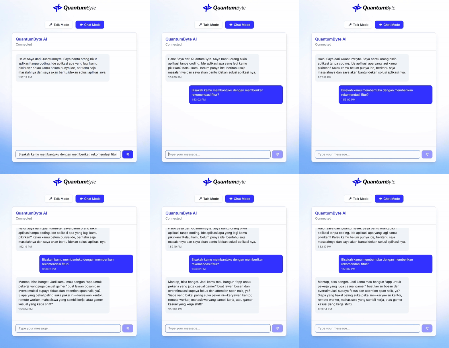

.png?alt=media)
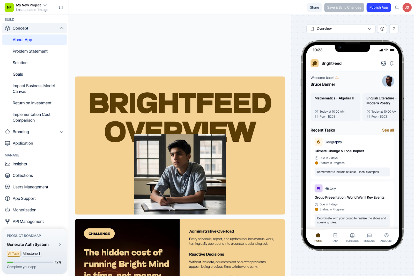
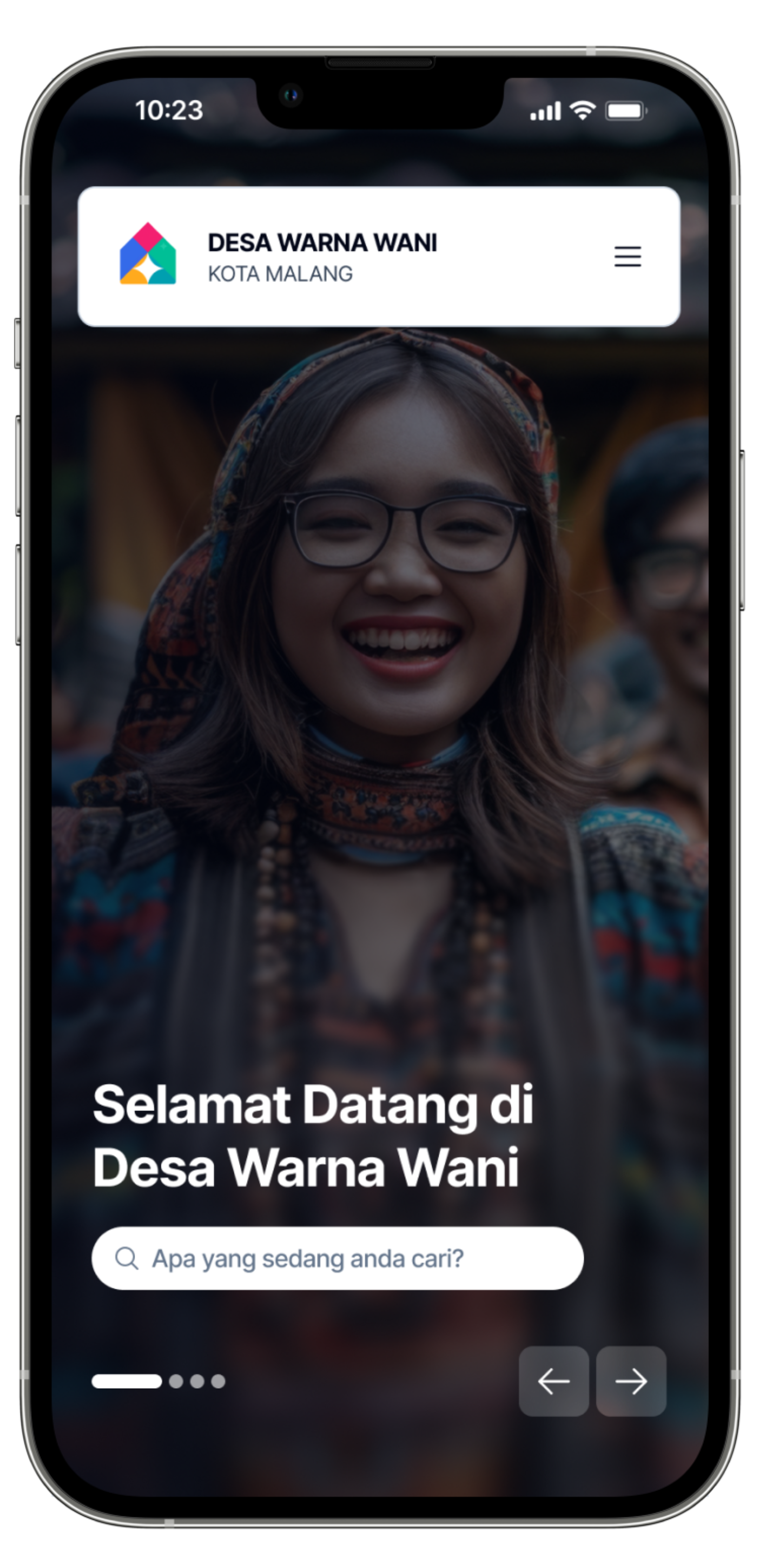
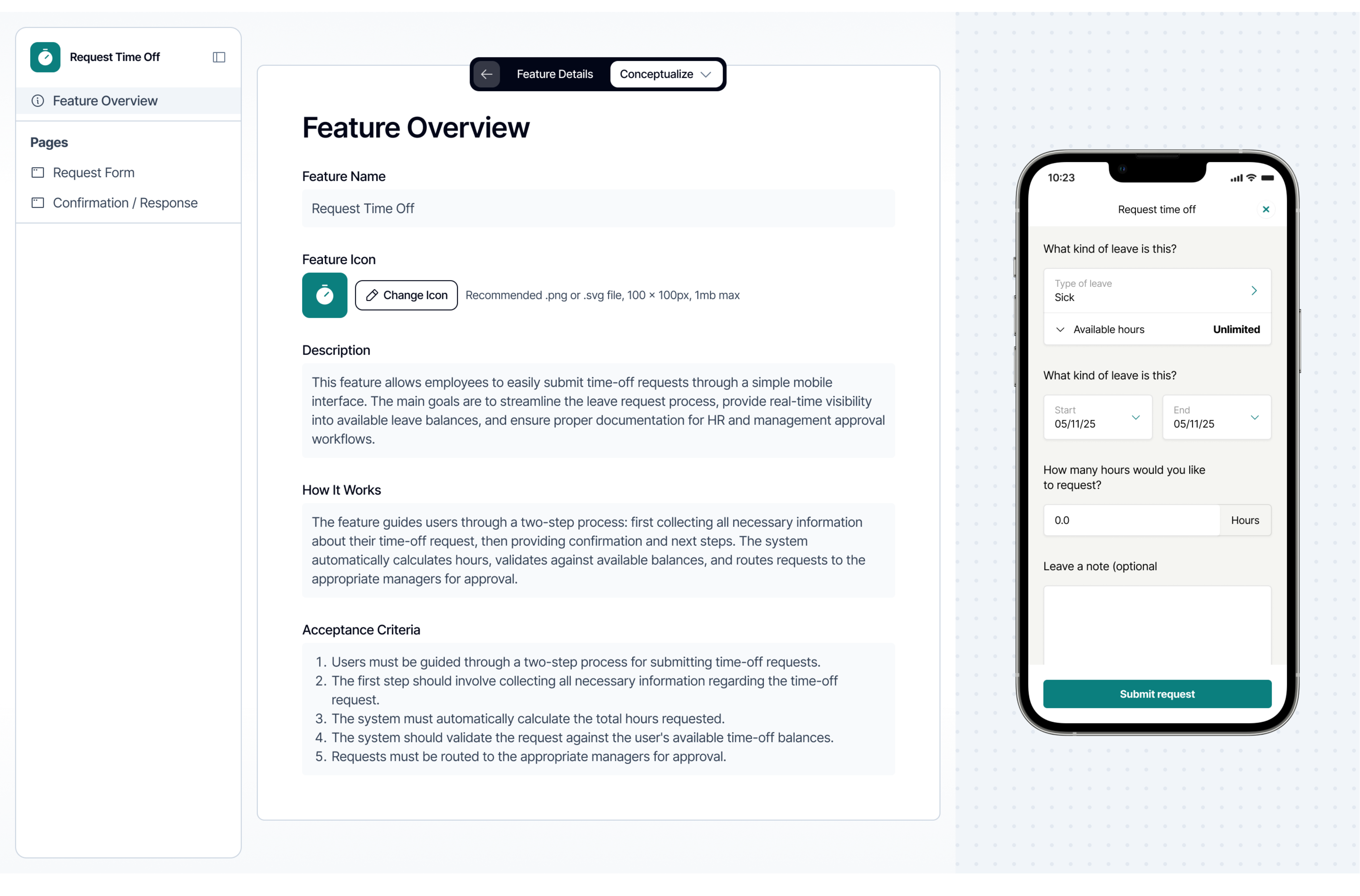
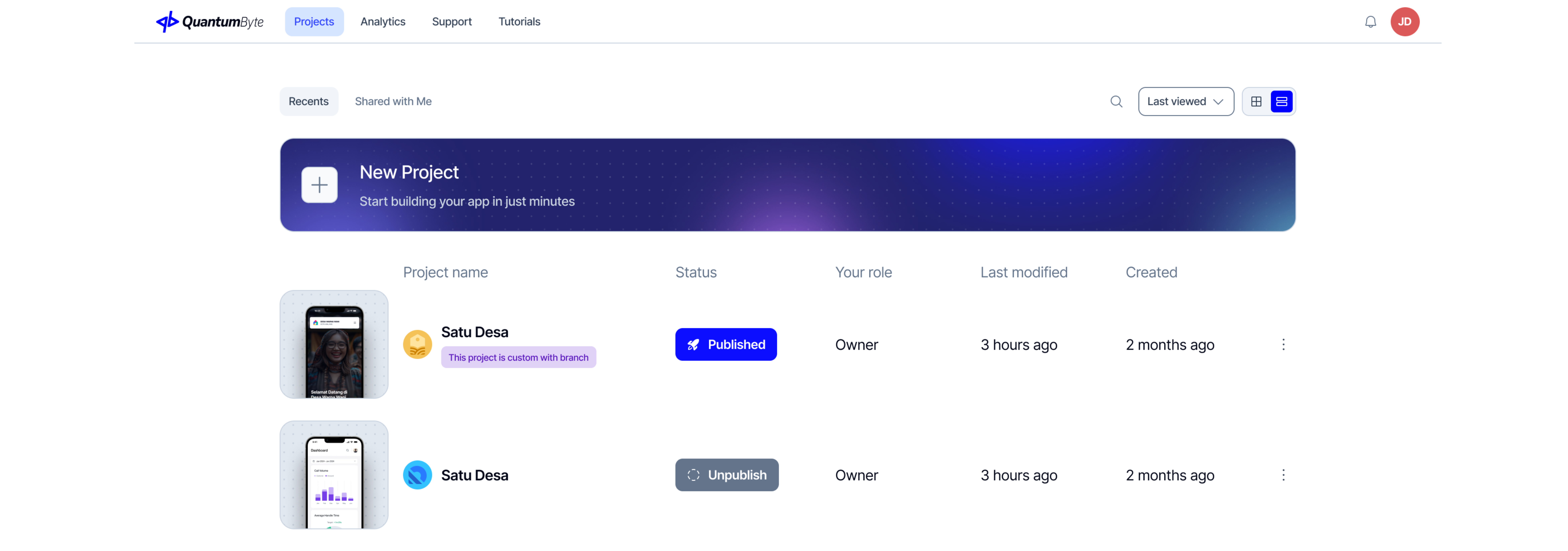
%20(1)%20(1).png?alt=media)
.png)
%20(1)%20(1)%20(1)%20(1)%20(1)%20(1)%20(1).png?alt=media)
%20(1)%20(1)%20(1)%20(1)%20(1)%20(1)%20(1).png?alt=media)
%20(1)%20(1)%20(1)%20(1)%20(1)%20(1)%20(1).png?alt=media)
%20(1)%20(1)%20(1)%20(1)%20(1)%20(1)%20(1).png?alt=media)
%20(1)%20(1)%20(1)%20(1)%20(1)%20(1)%20(1).png?alt=media)
%20(1)%20(1)%20(1)%20(1)%20(1)%20(1)%20(1).png?alt=media)
%20(1)%20(1)%20(1)%20(1)%20(1)%20(1)%20(1).png?alt=media)
%20(1)%20(1)%20(1)%20(1)%20(1)%20(1)%20(1).png?alt=media)
%20(1)%20(1)%20(1)%20(1)%20(1)%20(1)%20(1).png?alt=media)
%20(1)%20(1)%20(1)%20(1)%20(1)%20(1)%20(1).png?alt=media)
%20(1)%20(1).png?alt=media)
%20(1)%20(1).png?alt=media)
%20(1)%20(1).png?alt=media)
%20(1)%20(1).png?alt=media)
%20(1)%20(1).png?alt=media)
%20(1)%20(1).png?alt=media)
%20(1).png?alt=media)
.png?alt=media)
.png?alt=media)
.png?alt=media)
.png?alt=media)
.png?alt=media)
.png?alt=media)
.png?alt=media)
.png?alt=media)
.png?alt=media)
.png?alt=media)
.png?alt=media)
.png?alt=media)
.png?alt=media)
.png?alt=media)
.png?alt=media)
.png?alt=media)
.png?alt=media)
.png?alt=media)
.png?alt=media)
.png?alt=media)
.png?alt=media)
.png?alt=media)
.png?alt=media)
.png?alt=media)
.png?alt=media)
.png?alt=media)
.png?alt=media)
.png?alt=media)
.png?alt=media)
.png?alt=media)
.png?alt=media)
.png?alt=media)
.png?alt=media)
.png?alt=media)
.png?alt=media)
.png?alt=media)
.png?alt=media)
.png?alt=media)
.png?alt=media)
.png?alt=media)
.png?alt=media)
.png?alt=media)
.png?alt=media)
.png?alt=media)
.png?alt=media)
.png?alt=media)
.png?alt=media)
.png?alt=media)
.png?alt=media)
.png?alt=media)
.png?alt=media)
.png?alt=media)
.png?alt=media)
.png?alt=media)
.png?alt=media)
.png?alt=media)


.png?alt=media)
.png?alt=media)
.png?alt=media)

.png?alt=media)

.png?alt=media)

.png?alt=media)
.jpg)
.png?alt=media)
.jpg)
.png?alt=media)
.png?alt=media)
.png?alt=media)
.png?alt=media)
.png?alt=media)
.png?alt=media)
.png?alt=media)

.png?alt=media)
.jpg)
.png?alt=media)

.png?alt=media)
.png?alt=media)
.png?alt=media)
.png?alt=media)
.png?alt=media)

.png?alt=media)
.png?alt=media)
.png?alt=media)
.png?alt=media)

.png?alt=media)

.png?alt=media)

.png?alt=media)
.png?alt=media)
.png?alt=media)
.png?alt=media)
.png?alt=media)
.png?alt=media)
.png?alt=media)

.png?alt=media)
.png?alt=media)
.png?alt=media)
.png?alt=media)

.png?alt=media)

.png?alt=media)

.png?alt=media)
.png?alt=media)
.png?alt=media)

.png?alt=media)

.png?alt=media)

.png?alt=media)
.jpg)
.png?alt=media)

.png?alt=media)

.png?alt=media)
.png?alt=media)
.png?alt=media)
.jpg)
.png?alt=media)

.png?alt=media)

.png?alt=media)
.png?alt=media)
.png?alt=media)

.png?alt=media)
.png?alt=media)
.png?alt=media)
.png?alt=media)


.png?alt=media)
.png?alt=media)

.png?alt=media)

.png?alt=media)

.png?alt=media)

.png?alt=media)

%20(1)%20(1)%20(1)%20(1)%20(1)%20(1).png?alt=media)
%20(1)%20(1)%20(1)%20(1)%20(1).png?alt=media)
%20(1)%20(1)%20(1)%20(1)%20(1).png?alt=media)
%20(1)%20(1)%20(1)%20(1)%20(1).png?alt=media)
%20(1)%20(1)%20(1)%20(1).png?alt=media)
%20(1)%20(1)%20(1)%20(1).png?alt=media)
%20(1)%20(1)%20(1)%20(1).png?alt=media)
%20(1)%20(1)%20(1)%20(1).png?alt=media)
%20(1)%20(1)%20(1)%20(1).png?alt=media)
%20(1)%20(1)%20(1)%20(1).png?alt=media)
%20(1)%20(1)%20(1)%20(1).png?alt=media)

%20(1)%20(1)%20(1)%20(1).png?alt=media)

%20(1)%20(1)%20(1)%20(1).png?alt=media)

%20(1)%20(1).png?alt=media)

%20(1)%20(1)%20(1)%20(1)%20(1)%20(1).png?alt=media)

%20(1)%20(1)%20(1)%20(1)%20(1)%20(1).png?alt=media)

%20(1)%20(1)%20(1)%20(1)%20(1)%20(1).png?alt=media)

%20(1)%20(1)%20(1)%20(1)%20(1)%20(1).png?alt=media)
.jpg)
%20(1)%20(1)%20(1)%20(1)%20(1)%20(1).png?alt=media)

%20(1)%20(1)%20(1)%20(1)%20(1)%20(1).png?alt=media)

%20(1)%20(1)%20(1)%20(1)%20(1)%20(1).png?alt=media)
.jpg)
%20(1)%20(1)%20(1)%20(1)%20(1)%20(1).png?alt=media)

%20(1)%20(1)%20(1)%20(1)%20(1)%20(1).png?alt=media)

%20(1)%20(1)%20(1)%20(1)%20(1)%20(1).png?alt=media)
%20(1)%20(1)%20(1)%20(1)%20(1)%20(1).png?alt=media)
%20(1)%20(1)%20(1)%20(1)%20(1)%20(1).png?alt=media)
%20(1)%20(1)%20(1)%20(1)%20(1)%20(1).png?alt=media)
%20(1)%20(1)%20(1)%20(1)%20(1)%20(1).png?alt=media)
%20(1)%20(1)%20(1)%20(1)%20(1)%20(1).png?alt=media)
%20(1)%20(1)%20(1)%20(1)%20(1).png?alt=media)
%20(1)%20(1)%20(1)%20(1).png?alt=media)
%20(1)%20(1)%20(1)%20(1).png?alt=media)
%20(1)%20(1)%20(1).png?alt=media)
%20(1)%20(1)%20(1).png?alt=media)
%20(1)%20(1)%20(1).png?alt=media)
%20(1)%20(1)%20(1).png?alt=media)
%20(1)%20(1)%20(1).png?alt=media)
%20(1)%20(1)%20(1).png?alt=media)
%20(1)%20(1)%20(1).png?alt=media)
%20(1)%20(1)%20(1).png?alt=media)
%20(1)%20(1)%20(1).png?alt=media)
%20(1)%20(1)%20(1).png?alt=media)
%20(1)%20(1)%20(1).png?alt=media)
%20(1)%20(1)%20(1).png?alt=media)
%20(1)%20(1)%20(1).png?alt=media)
%20(1)%20(1)%20(1).png?alt=media)
%20(1)%20(1)%20(1).png?alt=media)
%20(1)%20(1)%20(1).png?alt=media)

%20(1)%20(1)%20(1).png?alt=media)
.jpg)
%20(1)%20(1)%20(1).png?alt=media)

%20(1)%20(1)%20(1).png?alt=media)

%20(1)%20(1)%20(1).png?alt=media)

%20(1)%20(1)%20(1).png?alt=media)

%20(1)%20(1)%20(1).png?alt=media)

%20(1)%20(1)%20(1).png?alt=media)

%20(1)%20(1)%20(1).png?alt=media)

%20(1)%20(1)%20(1).png?alt=media)

%20(1)%20(1)%20(1).png?alt=media)
%20(1)%20(1)%20(1).png?alt=media)

%20(1)%20(1)%20(1).png?alt=media)

%20(1)%20(1)%20(1).png?alt=media)

%20(1)%20(1).png?alt=media)

%20(1)%20(1).png?alt=media)

%20(1)%20(1).png?alt=media)

%20(1)%20(1).png?alt=media)

%20(1)%20(1).png?alt=media)

%20(1)%20(1).png?alt=media)
%20(1)%20(1).png?alt=media)

%20(1)%20(1)%20(1)%20(1)%20(1).png?alt=media)
.jpg)
%20(1)%20(1)%20(1)%20(1)%20(1).png?alt=media)

%20(1)%20(1)%20(1)%20(1)%20(1).png?alt=media)

%20(1)%20(1)%20(1)%20(1)%20(1).png?alt=media)
%20(1)%20(1)%20(1)%20(1)%20(1).png?alt=media)

%20(1)%20(1)%20(1)%20(1)%20(1).png?alt=media)
%20(1)%20(1)%20(1)%20(1)%20(1).png?alt=media)

%20(1)%20(1)%20(1)%20(1)%20(1).png?alt=media)
%20(1)%20(1)%20(1)%20(1)%20(1).png?alt=media)

%20(1)%20(1)%20(1)%20(1)%20(1).png?alt=media)
%20(1)%20(1)%20(1)%20(1)%20(1).png?alt=media)

%20(1)%20(1)%20(1)%20(1)%20(1).png?alt=media)
%20(1)%20(1)%20(1)%20(1)%20(1).png?alt=media)

%20(1)%20(1)%20(1)%20(1)%20(1).png?alt=media)
%20(1)%20(1)%20(1)%20(1)%20(1).png?alt=media)

%20(1)%20(1)%20(1)%20(1).png?alt=media)

%20(1)%20(1)%20(1).png?alt=media)
%20(1)%20(1)%20(1).png?alt=media)

%20(1)%20(1)%20(1).png?alt=media)

%20(1)%20(1).png?alt=media)

%20(1)%20(1).png?alt=media)
%20(1)%20(1).png?alt=media)

%20(1)%20(1).png?alt=media)
%20(1)%20(1).png?alt=media)

%20(1)%20(1).png?alt=media)

%20(1)%20(1).png?alt=media)
%20(1)%20(1).png?alt=media)

%20(1)%20(1).png?alt=media)

%20(1)%20(1).png?alt=media)

%20(1)%20(1).png?alt=media)

%20(1)%20(1).png?alt=media)
.jpg)
%20(1)%20(1).png?alt=media)

%20(1)%20(1).png?alt=media)

%20(1)%20(1).png?alt=media)
%20(1)%20(1).png?alt=media)

%20(1)%20(1).png?alt=media)

%20(1)%20(1).png?alt=media)
%20(1)%20(1).png?alt=media)

%20(1)%20(1).png?alt=media)

%20(1)%20(1).png?alt=media)

%20(1)%20(1).png?alt=media)